I love the colors and artwork of the February page kit. The Turquoise layouts could not have been more perfect for showcasing photos from the Club Scrap 20th Anniversary cruise.

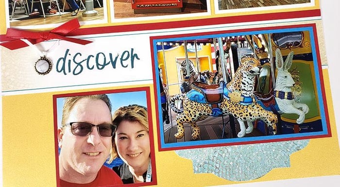
More photos than mats? Add a cropped photo to the left of the title strip. (No mat necessary!)
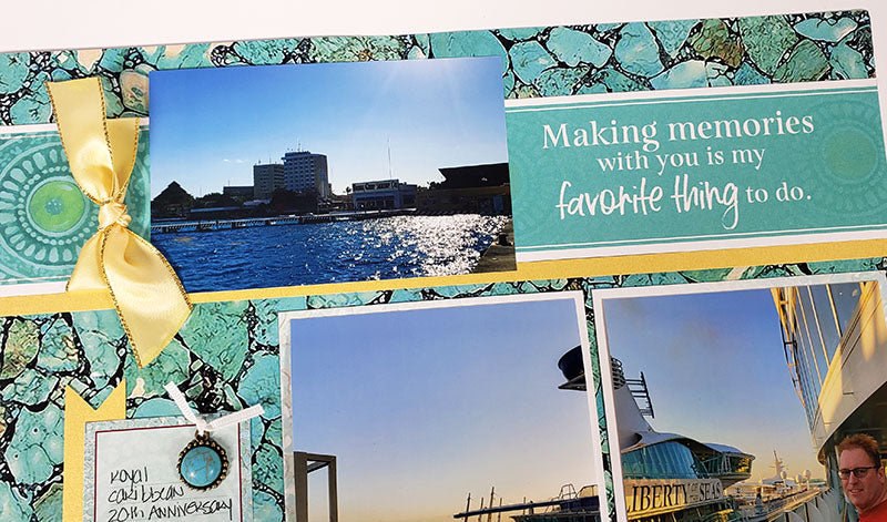
Wasn't it nice of the Mike-man to wear red? LOL. You'd think it was planned, but it was a happy coincidence. As luck would have it, the pop of red is what ties everything together so seamlessly!

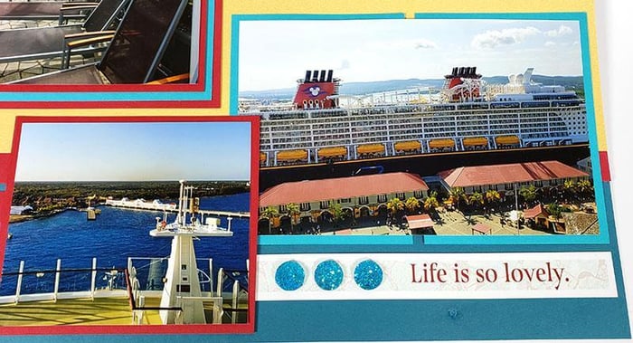
Are you seeing this? I don't think I could have come up with a better color combo to match these photos if I tried!

It's almost as if these pics were made for this kit! Perfection.

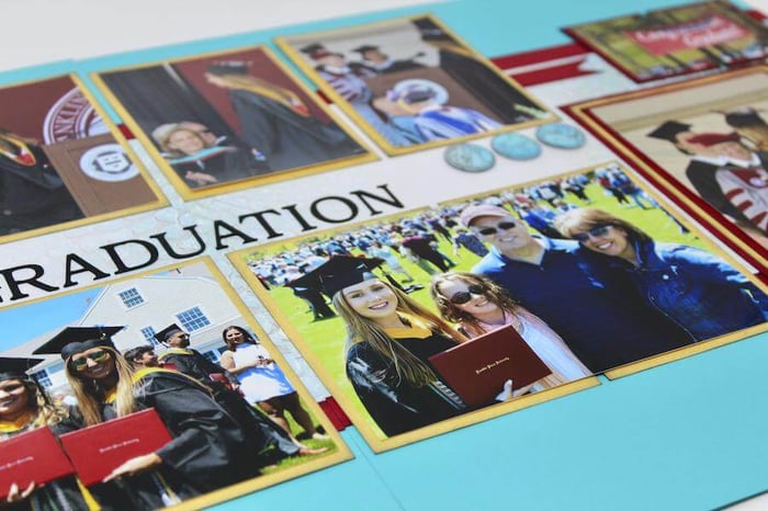
When needed, consider spreading larger photos across a pair of mats, instead of cropping four individual photos.

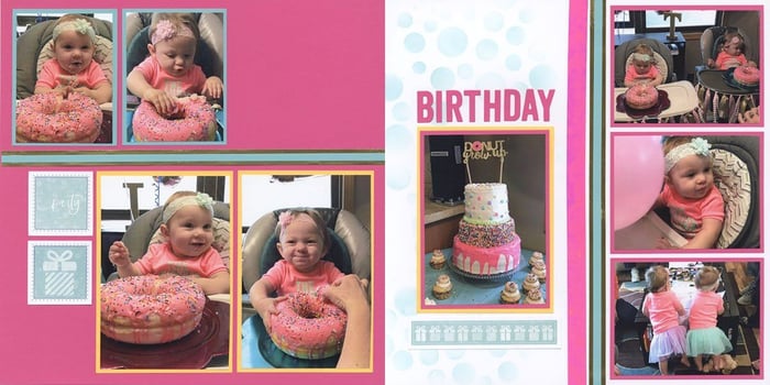
I'm a firm believer blues, greens, teal and turquoise colors go with just about everything. And the sentiments and artwork of the Turquoise layouts are so versatile, they're appropriate for many different occasions.
So what are you waiting for? Grab your photos and get scrappin'!

