
Everyone here at the warehouse is pretty excited about our latest collection. Not to say that we don't love all of our "children," but maybe it's okay to be particularly fond of this one?

The first step was to bid farewell to Wisconsin's winter with this gorgeous color palette.

A NOTE FROM TRICIA
This whole March Madness thing started when I saw a "bracket" for Ken's Seasonings last March. Vote for your favorite seasonings, it said. And I thought, gee, it would be super-fun to do something like that. Our team developed the idea of making a bracket to help us choose our next remix, and the rest is history.

The trailer is getting packed with booth and classroom supplies for two big road trips this month. Meet me in St. Louis, Louis! We hope to see you there this week Friday and Saturday. Two weeks later we'll be at the Milwaukee State Fairgrounds April 21 and 22.
WHAT'S AHEAD?
The unprecedented popularity of the National Parks collection and its remix has us super excited about our release of the Adirondacks kit next month. The color palette is warm and the artwork has a distressed, classic look. Get ready to adjust your "altitude!"
KIT AND COLOR DETAILS
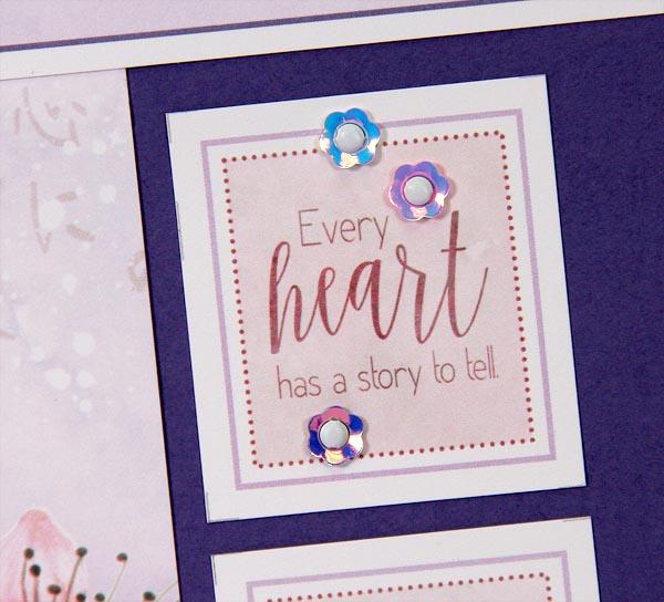
The hunt for the perfect font(s) for a collection can take hours. Legibility is always our first priority, and we like how this month's pairing meshes together. You can download Charlotte (not free) and Desereted to assist you in creating coordinating titles and journaling for your projects. Kay's greeting card masterpieces were made with her favorite Club Scrap inks including Amethyst, Fuchsia, Carnation, White Pigment, India Black, Jet Black, and Silver.
DELUXE LAYOUTS

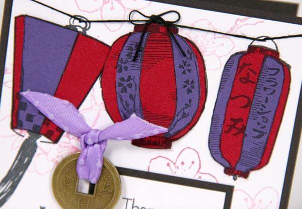
Until you see them "in person," it will be difficult to appreciate the intricate beauty of the sheet of die cut blossom stickers we included in the Deluxe kit. The flowers are printed on a sturdy cover stock, foil stamped, and die cut.

I placed them onto the printed artwork on a layout below. Looks like a perfect match to me!

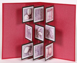
GREETINGS TO GO

OK, I'll be the first person to admit that the 5x7 Greetings to Go cards are a bit of a project, but I promise they're worth the effort! You'll trim the large gray panels into nine tabs or "flags", nest them with nine unique pieces of artwork, and adhere them to the accordion-folded insert. The result is a gorgeous pop-up card.
We'll go into more detail about the layouts and cards tomorrow. See you then!
Tricia