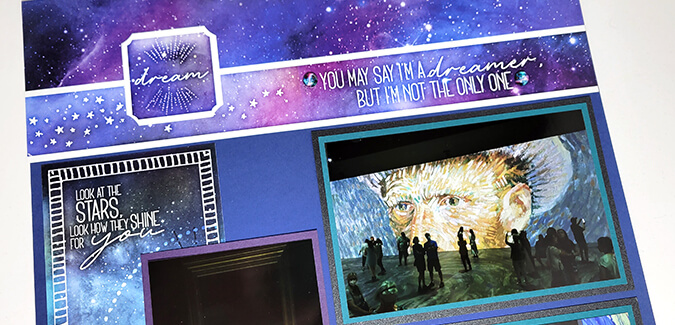
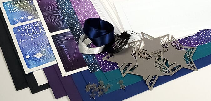
I'm over the moon over the December collection! I raced to assemble my Galaxy Page kit early this month so I could add photos and share them with you as inspiration for your own pages.
To better illustrate my usual process, I'll share the "nekkid" pages (as designed by Tricia) first, followed by my personal layouts - complete with photos and journaling. I'll also highlight any tweaks I made to the layouts to better fit my photos.
Galaxy Page Kit
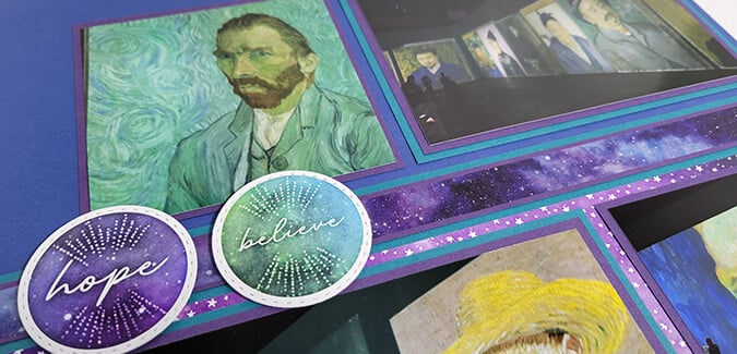
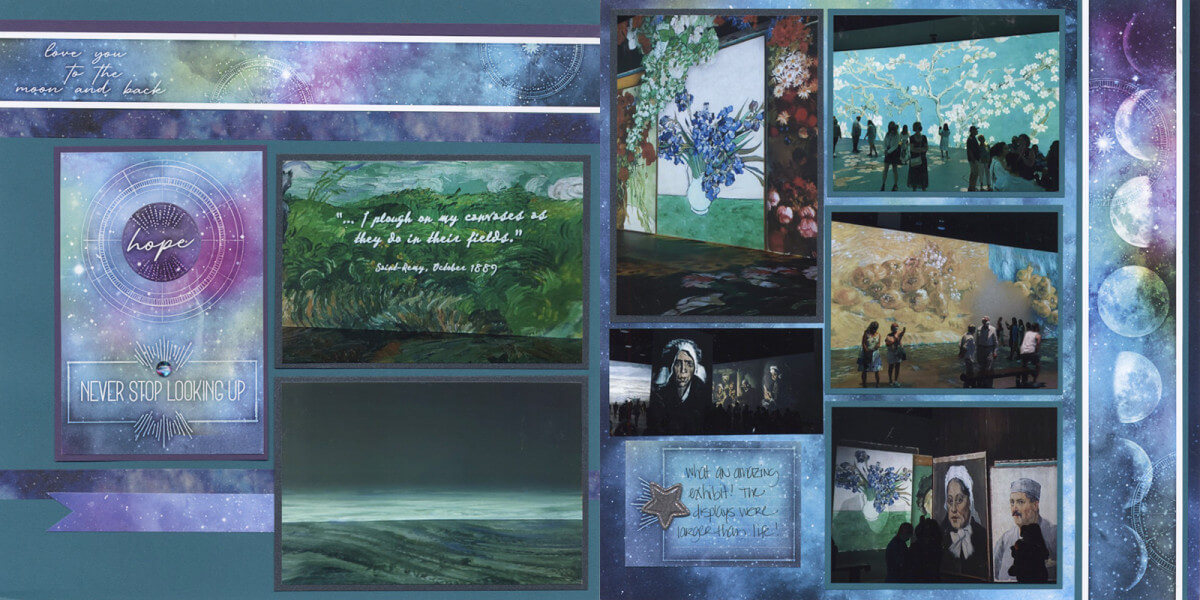
From the moment I first saw the artwork for the Galaxy collection, I knew it would be perfect for scrapbooking my visit to see the Beyond Van Gogh exhibit in Milwaukee. I took tons of photos, and the finished Galaxy pages make an excellent home for them.
Layout 1 & 2
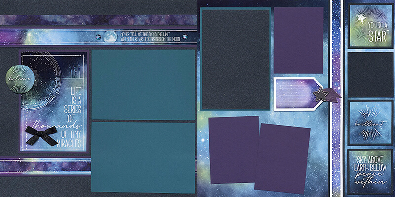
Most of the layouts worked well "as is", so I didn't need to make many changes when adding photos. I was thrilled with the number of mats available for photographs on each spread.
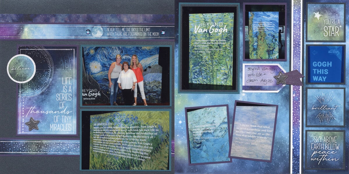
Layout 3 & 4

The sentiment didn't really fit the occasion, so I trimmed a photograph to fit the open space on the cutapart.
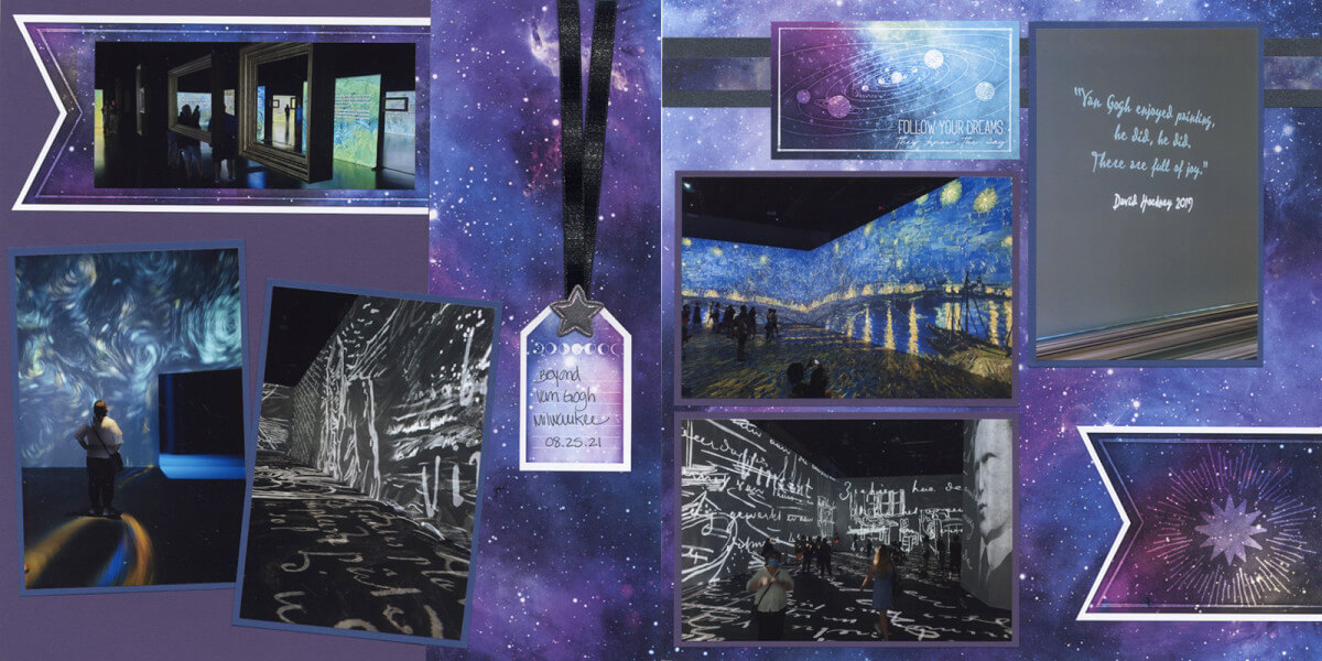
Layout 5 & 6
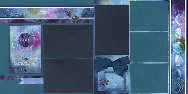
Since I had so many pictures to scrap, I replaced the bow with an additional cropped photo.
Layout 7 & 8
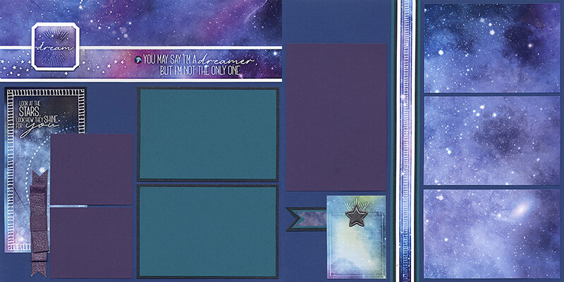
As sometimes happens, I needed space for more vertical than horizontal photos. Rotating the right page 90 degrees and making slight adjustments to the cutaparts fixes the issue.
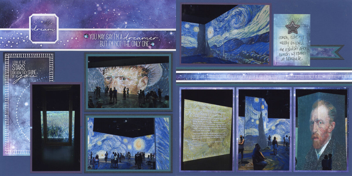
I hope you're inspired by my finished layouts. What will you scrap on the Galaxy collection?
Happy scrapping!
