Tricia and I both completed layouts from the French Quarter Page Kit in record time. The color palette and artwork make it user-friendly and appropriate for more occasions than you might think. Enjoy a side-by-side comparison of the blank layouts and our completed pages below, as we (hopefully) demonstrate the versatility of this collection.
French Quarter Layouts
Layout 1 & 2
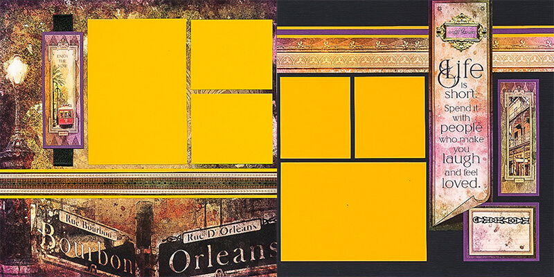
Tricia
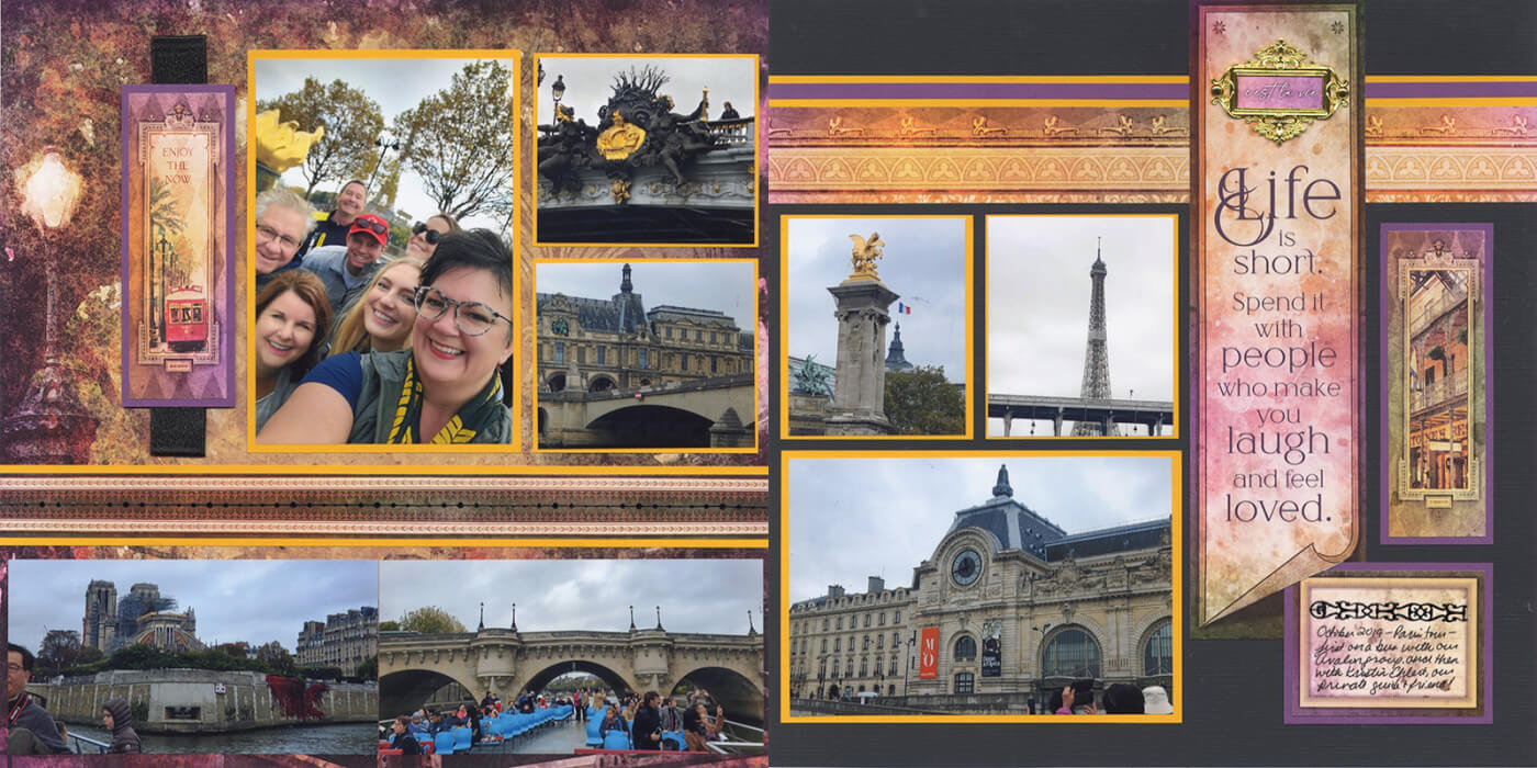
Have more photos than mats? No problem. Tricia added two cropped photos in the open space at the bottom of page 1.
Karen
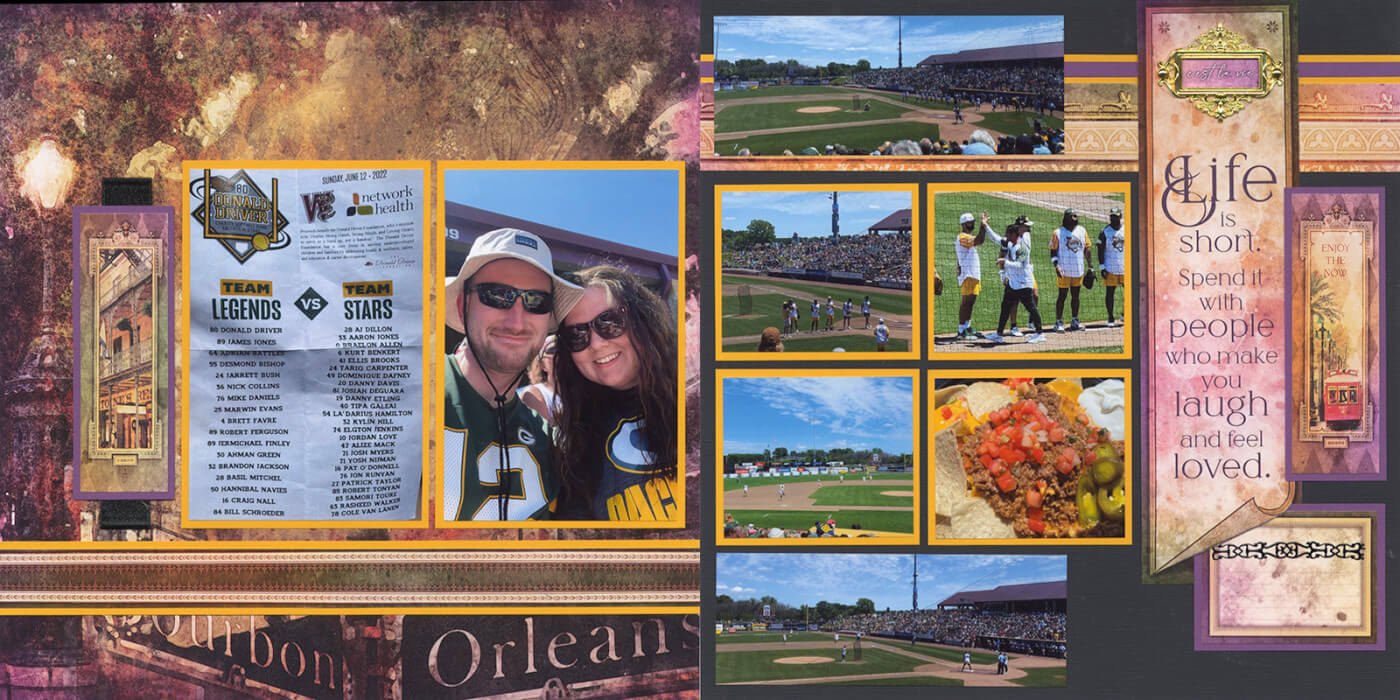
Packers football photos on French Quarter? You betcha! Actually, these photos are from the Donald Driver Charity Baseball Game (A former Green Bay Packer player).
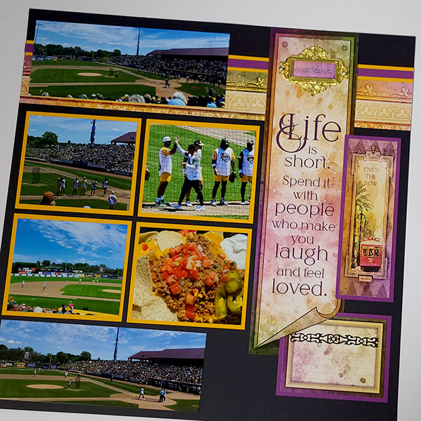
Switching a full-size mat with two smaller mats allows for the four-up arrangement on page 2. Two cropped photos of the playing field fit perfectly above and below.
Layout 3 & 4
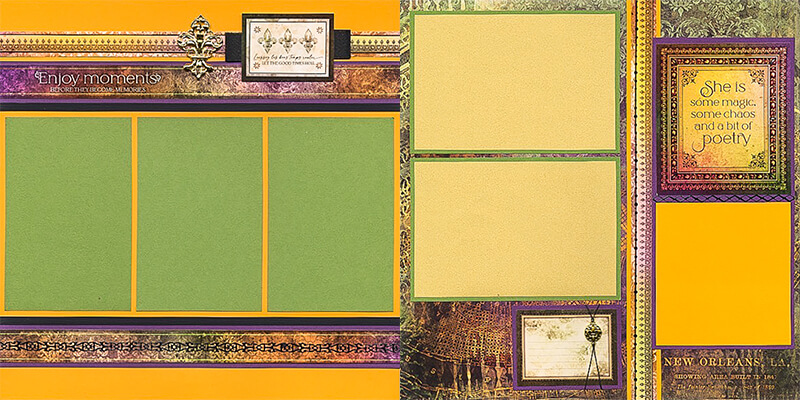
Tricia
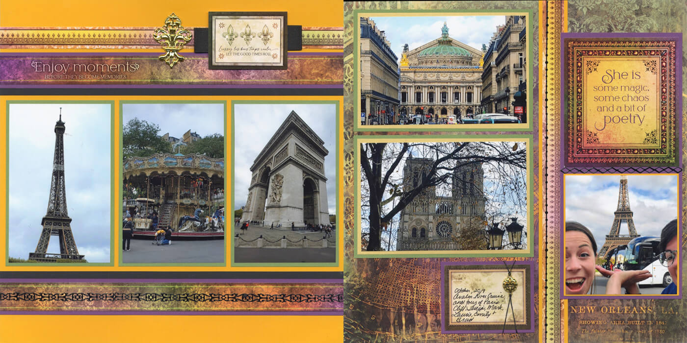
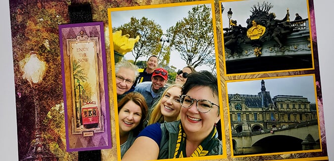
Photos from Tricia's European river cruise look amazing on this collection.
Karen
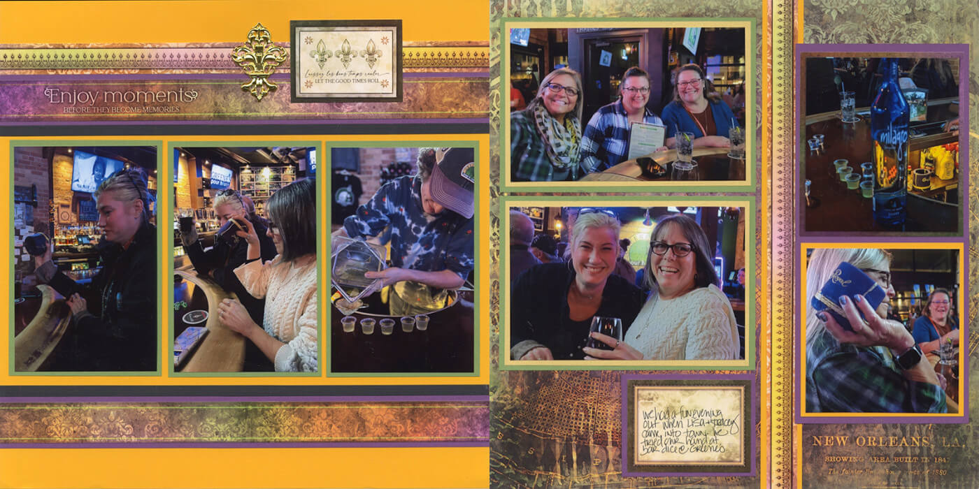
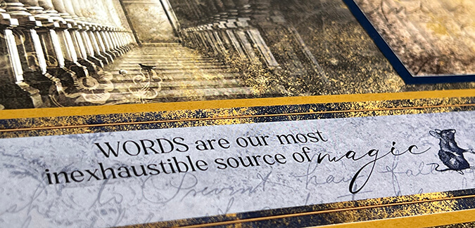
Crop an extra photo to fit over the sentiment cutapart on page 4.
Layout 5 & 6
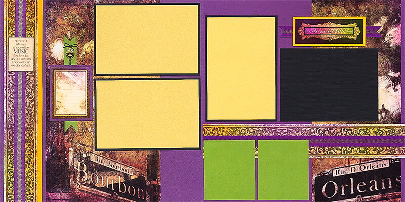
Tricia

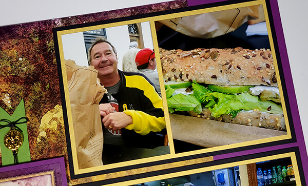
On the left side, Tricia cropped two vertical photos to fit the single horizontal mat.
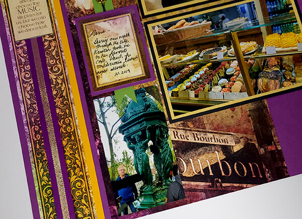
An extra vertical photo fits the open space below the journaling cutapart.
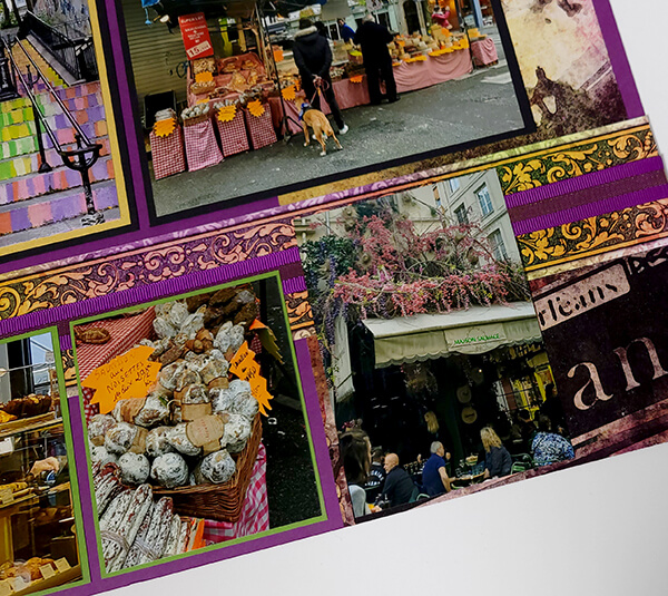
On the right, another vertical photo is added to the bottom of the page - no mat necessary.
Karen
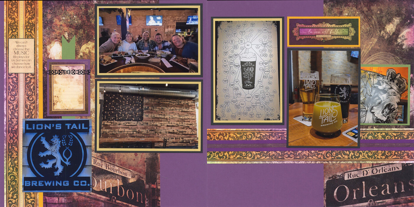
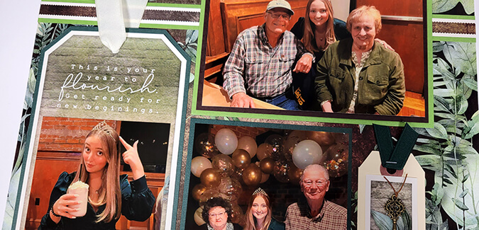
Like Tricia, I also added an unmatted photo below the journaling cutapart.
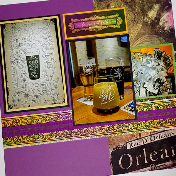
Since I had two vertical photos, a bit of rearranging the mats on page 6 was a great solution.
Layout 7 & 8
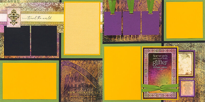
Tricia
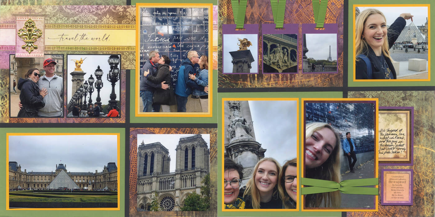
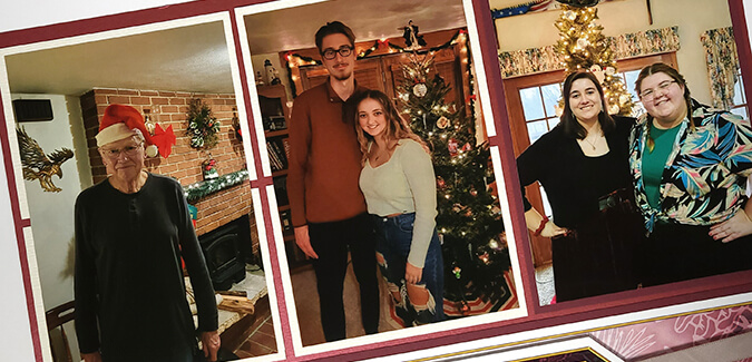
Tricia was able to add two more photos to this spread. She simply tucked a cropped photo into the lower right quadrant of the left page, and over the cutapart sentiment on the right page.
Karen
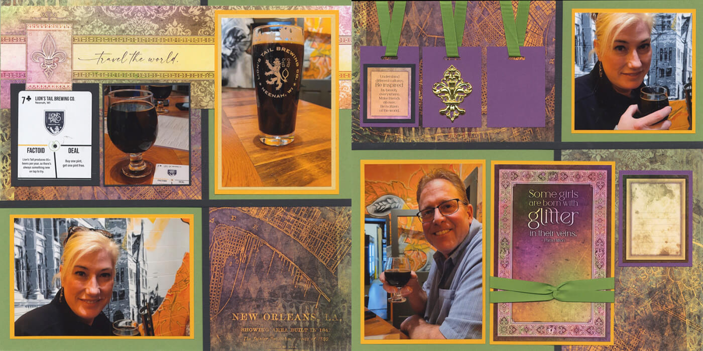
The colors of my photos were a great match for the French Quarter palette, but I didn't have quite enough photos to fill every mat. Re-arranging elements allowed me to tell the story without compromising the overall balance of this two-page spread.
Tricia and I hope sharing our completed pages helps inspire you to scrap your own. If you do, be sure to share your finished layouts with fellow Club Scrap fans on our Facebook Chat Group.
