
Tricia originally published this article in 2014 and it contains valuable information that still holds true today. The six tips for layout design shared below are truly timeless—and totally worth sharing again!
Six Tips for Layout Design
Have you ever had the sense that your finished layouts felt a little "off"? To ensure success, stick with the following six principles when creating scrapbook pages with our bonus page formulas and monthly page kit instructions.
For the purposes of this post, the featured formula is the bonus page formula our members received in July, 2014.
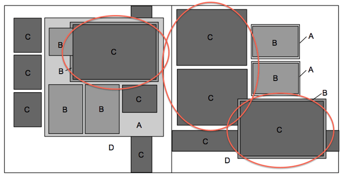
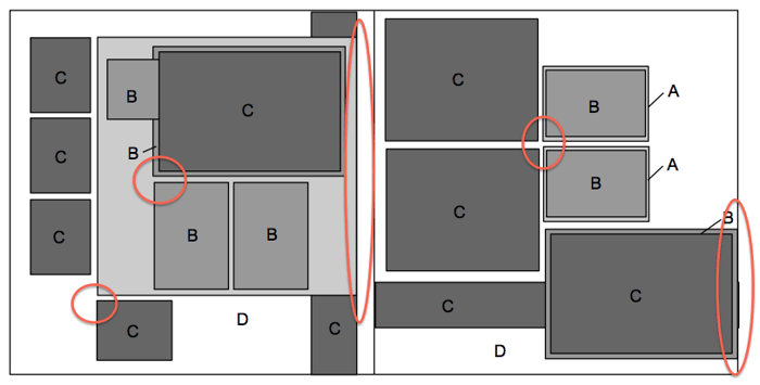
1. Focal Images
Think of your page as a theater production. Select your best photos to be the "leading characters." Feature those images on the full 4x6 single or double mats. In the July 2014 Bonus Page Formula, there are two double-mats for focal images and two additional co-stars with single mats.
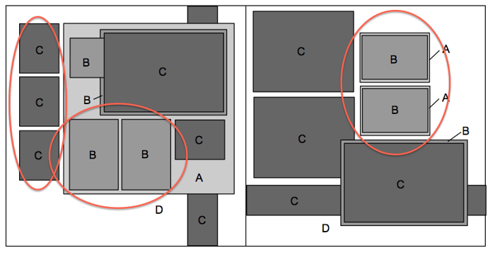
2. Groups
Compliment focal images with groups of smaller items. These are the "supporting characters" of your theater production. This sketch has several sets of sub groups. The smaller spots can also be an ideal location for journaling or non-photo embellishments.
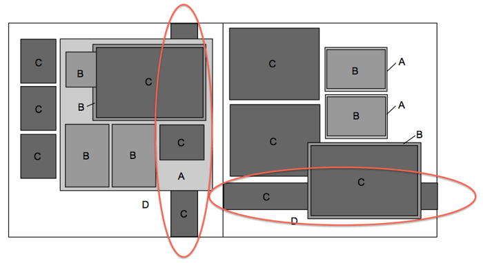
3. Anchoring Strips
This is the "backstage crew" of your production! Anchor elements on the layout with 12" strips to prevent that uncomfortable "floating" feeling. Anchors vary in width and are created with strips of paper, ribbons or even a row of stamped images. I like to alternate with horizontal and vertical anchoring strips.
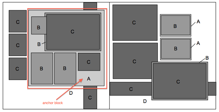
4. Anchoring Blocks
In addition to strips, another helpful grounding tool is a block of solid or printed paper beneath a group of items. I frequently use complete sheets of 8.5x11" paper as an anchoring block. It also subdivides the page into smaller areas and can make the space seem less overwhelming.
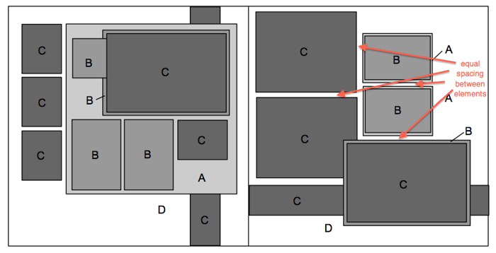
5. Spacing
I like to separate elements on the page with equal spacing within groups. Notice how all of the elements on the double page spread have a perimeter of roughly the same distance. This helps create a cohesive feeling within the group. Try to avoid placing pieces at the top, bottom and outside edges.
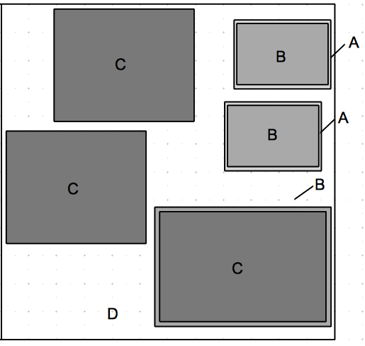
Note the difference: The lack of anchoring, grouping, and spacing principles in the example below, vs. the sketch above.
6. Tangents
A tangent simply indicates that two things are touching - and not in a good way. Avoid a tangent created by two corners/edges touching or aligning with one another. The first illustration below shows ideal placement of corners.
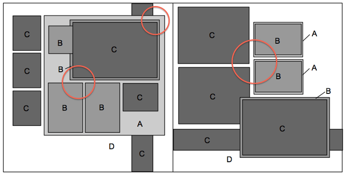
Study the differences between the spacing and arrangement above with the layout below; observe the newly-formed tangents. Aligning the vertical anchoring strip with the edge of the anchor block causes the photo mat in the lower right corner to form a tangent with the right edge of the page. The other newly-formed corner tangents are not as problematic, but you can see the arrangement above makes for a much better layout.
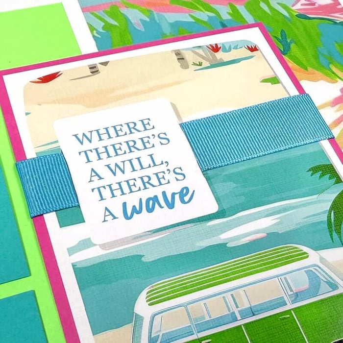
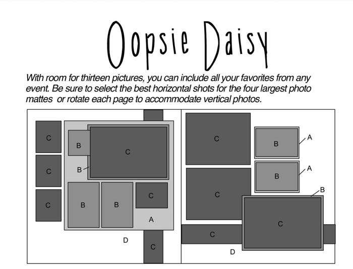
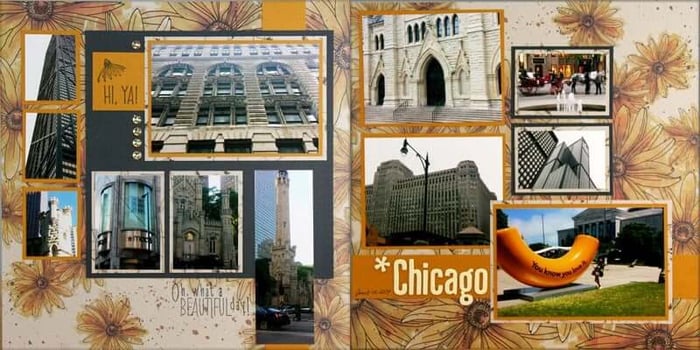
Oopsie Daisy Layout—Tricia
To demonstrate these principles, Tricia created the layout below by pairing the July 2014 Page Formula with papers from the (now-extinct) Oopsie Daisy collection.
Adapting the sketch is easy once you know the basic principles. Preserve the tall water tower image by adding it to the grouping on the bottom half of the left page. The anchoring strip on the right was a terrific place for a page title.
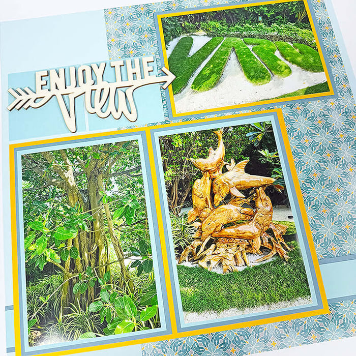
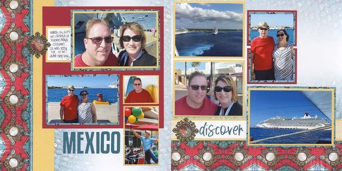
Turquoise Pages—Karen
I made this layout using the same formula back in 2020 featuring the Turquoise (02.20) collection. Even though these materials are no longer available, it's still a great way to demonstrate the versatility of the formula.
As you can see, I relocated the three mini mats to be positioned below the focal photo. A single cropped photo spans the space created by the twin mats. Die cut letters create the page title. On the right, a single vertical photo covers the two smaller stacked mats.
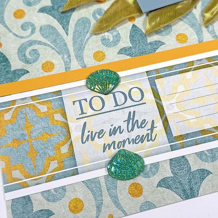
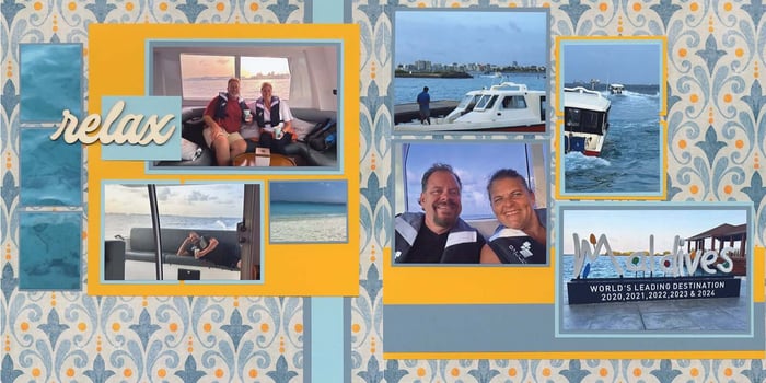
Cabana Layout—Karen
Since the original formula includes two sheets of 8.5x11 on the "Gather" list, you'll end up with 1" and 3.5" wide paper strips left over when you trim a 12x12. Include these leftover strips in your layout or save them for another project.
To duplicate my finished pages, utilize the paper substitutions below:
- 8.5x11 Paper A = 12x12 Gold
- 8.5x11 Paper B = 12x12 Med. Blue
- 12x12 Paper C = Dk. Blue
- (2) 12x12 Paper D = Blue Print
A single cropped photo spans the space created by the twin mats on the left page. A "relax" woodcut (Sea Glass 2024) serves as the page title. On the right, a single vertical photo covers the two smaller stacked mats.
Now It's Your Turn
Want to give these six tips a try? Download a complimentary copy of the July 2014 Page Formula to practice these principles for yourself.
Looking for even more inspiration? Browse the full selection of page formulas currently available in our online store. There are literally dozens to choose from and they are the perfect way to transform your paper stash into finished layouts!
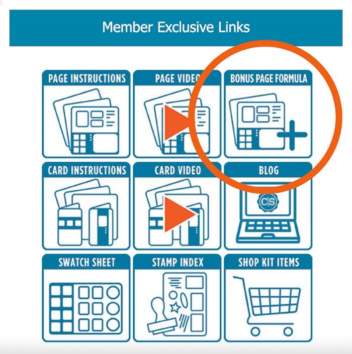
Members: Don't forget to consult your exclusive monthly member email to download your Bonus Page Formula. You'll enjoy instant inspiration and complete paper trimming instructions every month!
Discover dozens more page formulas available for immediate download:
2025 Page Formulas

$22.17
THIS IS A DIGITAL PRODUCT SENT VIA EMAIL Make a minimum of 24 scrapbook pages! Download includes TWELVE 2-page formulas with cutting and assembly instructions designed to work with 12x12 papers. So much more than a page sketch, our formulas… Read More
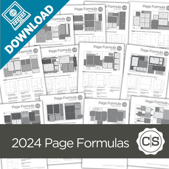
2024 Page Formulas
$22.17
THIS IS A DIGITAL PRODUCT SENT VIA EMAIL Make a minimum of 24 scrapbook pages! Download includes TWELVE 2-page formulas with cutting and assembly instructions designed to work with 12x12 papers. So much more than a page sketch, our formulas… Read More
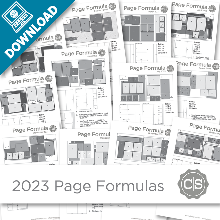
2023 Page Formulas
$22.17
THIS IS A DIGITAL PRODUCT SENT VIA EMAIL Make a minimum of 24 scrapbook pages! Download includes TWELVE 2-page formulas with cutting and assembly instructions designed to work with 12x12 papers. So much more than a page sketch, our formulas… Read More
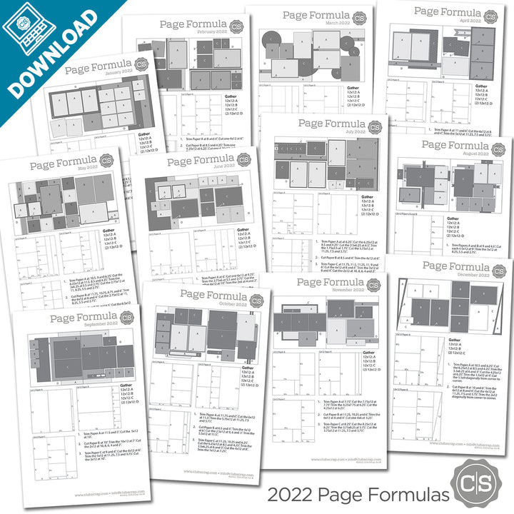
2022 Page Formulas
$22.17
THIS IS A DIGITAL PRODUCT SENT VIA EMAIL Make a minimum of 24 scrapbook pages! Download includes TWELVE 2-page formulas with cutting and assembly instructions designed to work with 12x12 papers. So much more than a page sketch, our formulas… Read More