The National Parks Lite pages were all "framed up" on a Friday afternoon and finished in a snap on Monday morning. (My least favorite task is sticking everything down, so if anyone is interested in that job . . .)
LAYOUTS 1 & 2 I like how the outlined text bursts out of the artwork on the 12x12 Ivory Print. It's such a cool element that can be used as a full print or to anchor the page.
  LAYOUTS 3 & 4
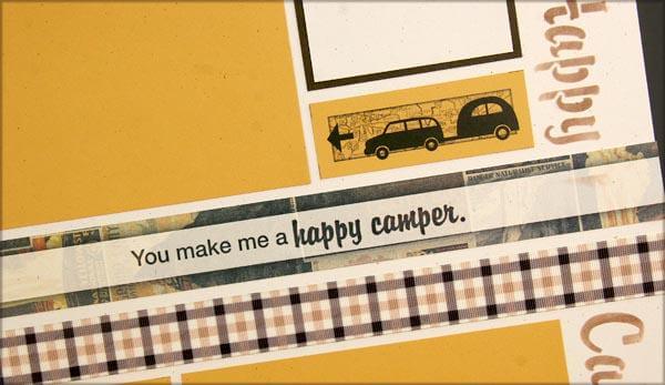
 And how about that Happy Camper Stencil? It's just the sweetest thing ever! I used it on the lower right of this spread with a CS Ink Applicator and Mahogany ink.
  LAYOUTS 5 & 6
 The Brown Plaid Ribbon reminds me of the tablecloth my mom used to cover the picnic table at our campsite on Lake Michigan.
  LAYOUTS 7 & 8
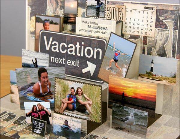
 When adding photos to a page like this, I'm always willing to place photos over the printed cutaparts if I have tons on hand. But it's nice to have the elements in place for occasions where I only have a handful of pictures.
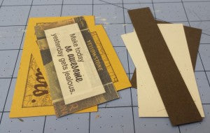
  When I finished creating the pages, this is what was left. Waste not, want not!
It's not too late to pick up the National Parks Lite kit for yourself. Join us today! Tricia
