It's that time again! I'm sharing an in-depth look at the assembled layouts created using the Under the Sea Page Kit, as well as all eight pages complete with photos and journaling. Read on to learn more!
Under the Sea Page Kit
Layout 1 & 2
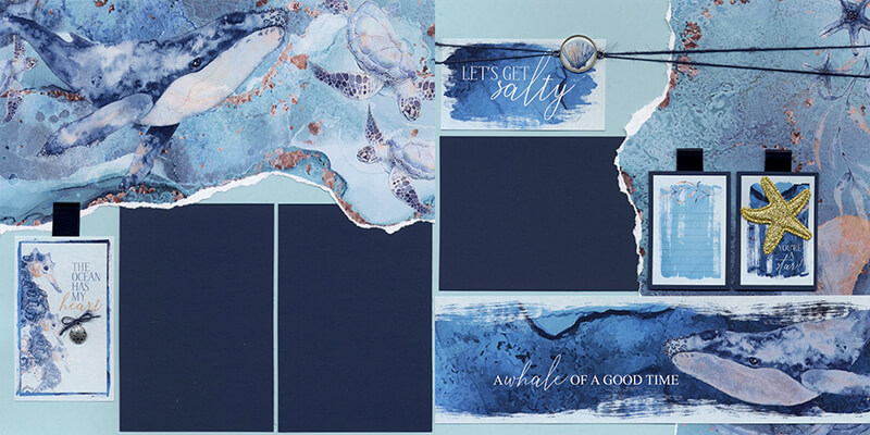
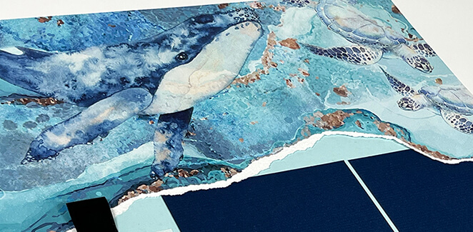
Don't you just love how the torn paper edge mimics ocean waves? While the artwork is stunning on its own, the layout is arranged in such a way that your photos really shine.
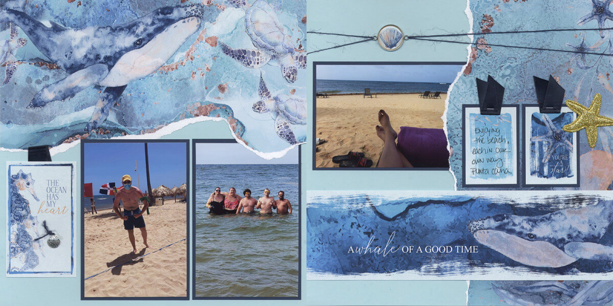
I made tiny tweaks to this spread, like skipping the "salty" cutapart. Slight shifts to the title strip and silver setting placement mean you don't even realize it's missing.
Layout 3 & 4
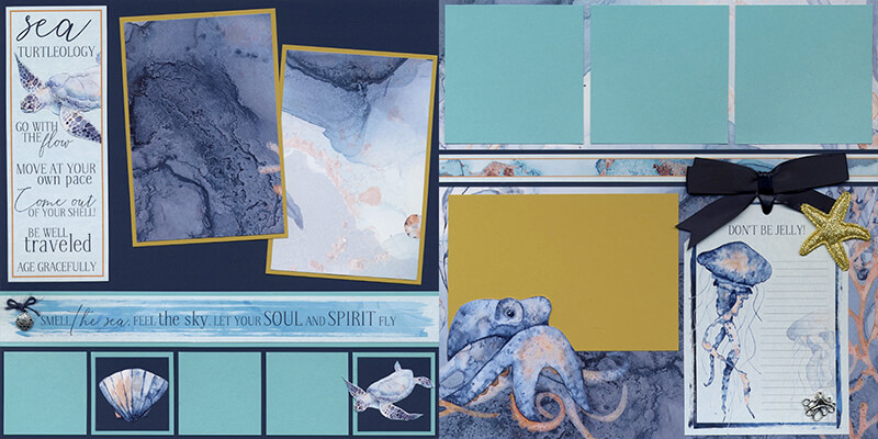
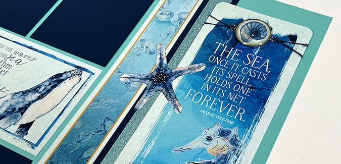
A bit of craft knife magic makes quick work of fussy-cutting the shell and sea turtle, and allows Mr. Octopus to make a splash. If you're unsure about the technique, simply watch Tricia's page assembly video for a quick "how to".
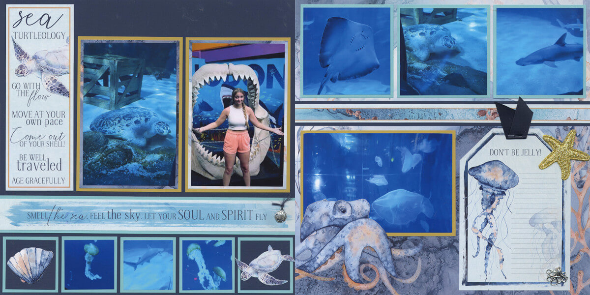
Careful measuring with a grid ruler allowed me to "straighten out" the two vertical mats on the left page. I also rearranged the placement of the cutaparts on the small square mats across the bottom. Sheer laziness led to stapling a snippet of blue ribbon to the tag, rather than making the beautiful bow like Tricia did. (Now I just have to get my son's GF to help me with the journaling.)
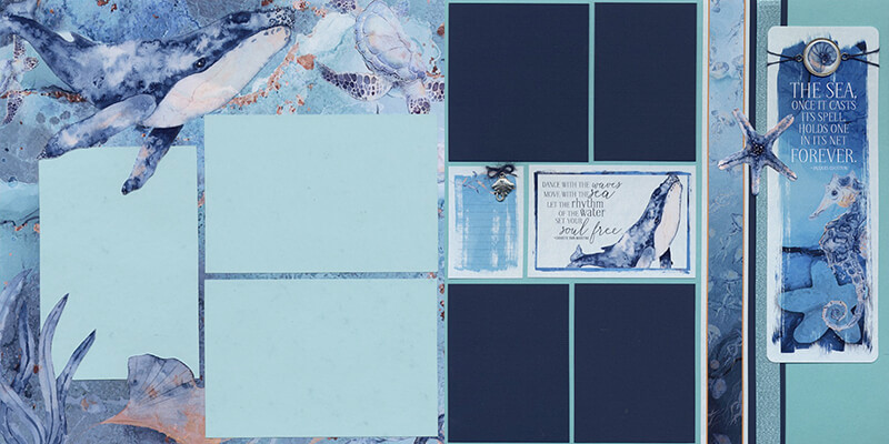
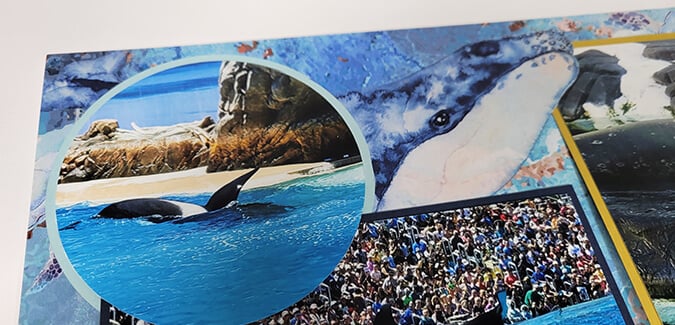
More savvy trimming with a craft knife brings the whale, sea grass and shell into the foreground on the left page.
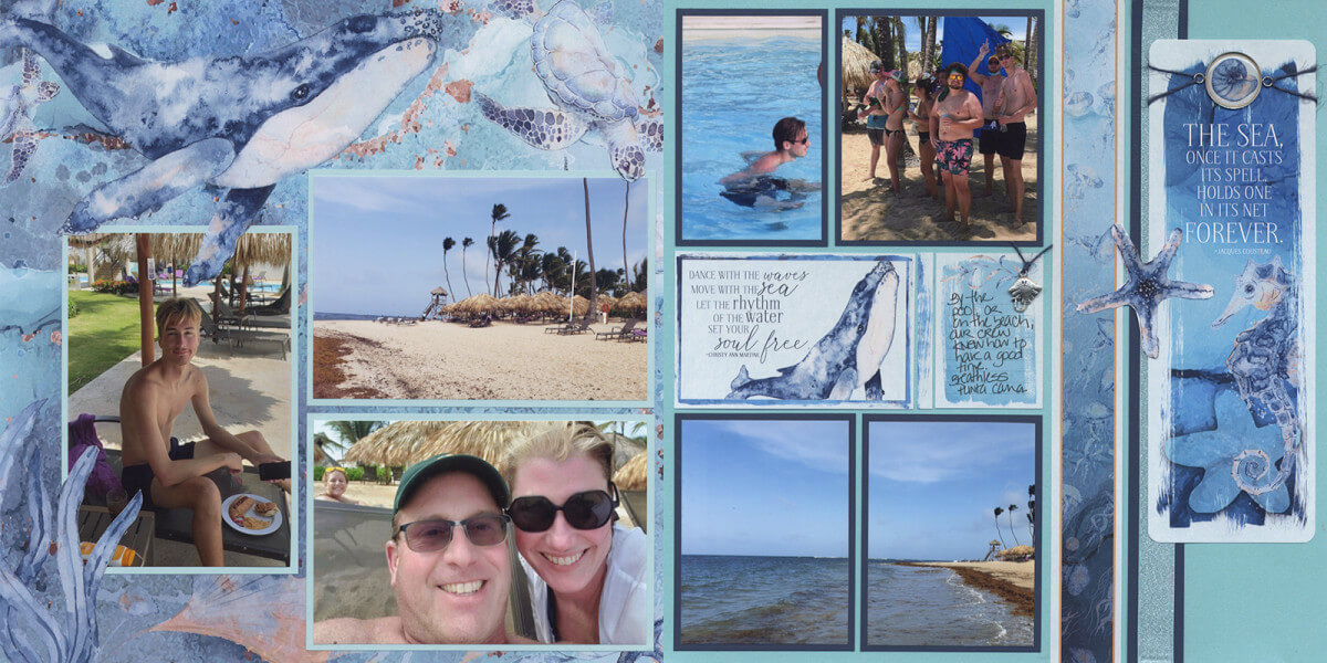
This two-page spread didn't require any changes - it was practically perfect in every way!
Layout 7 & 8
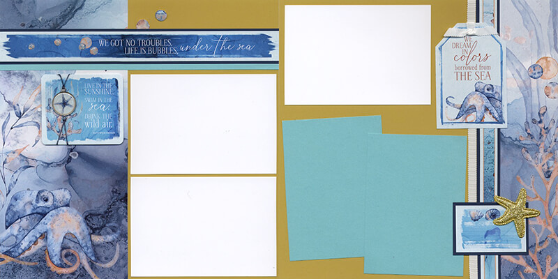
Can you hear Sebastian singing, too? Song lyrics from The Little Mermaid make a whimsical page title for this two-page spread.
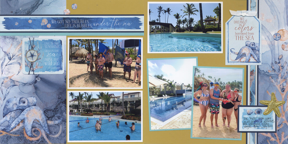
I didn't change a thing here, either. The layout arrangement was perfect for my photos.
I "shore" so love the Under the Sea collection! With another trip coming up, I see more "fin-tastic" pages it in my future.
Happy scrapping!
