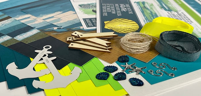
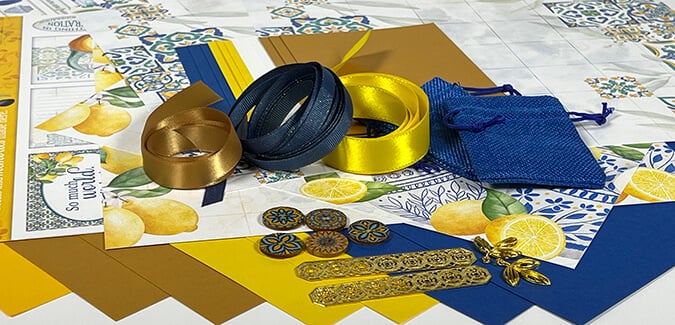
Members: Have you downloaded your Legacy Bonus Page Formula yet? If you're not using this super-useful monthly membership benefit, I encourage you to start now!
Not sure where to find it? Check your inbox for your member-exclusive email with important links to the bonus formula, instructions, video tutorials and more. It is sent to active members* on their scheduled shipping day and looks like this:

*An active member is defined as one who paid for and received the current monthly kit.
Legacy Bonus Formula Sketch

The July Bonus Formula creates a well-balanced two-page spread that holds up to 16 photos. To make the layout, gather five 12x12 papers. Follow the trimming instructions on the printable document, then assemble the layout using the sketch as your guide.
July Bonus Formula Layout - Karen
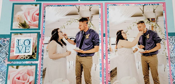
It's serendipitous that Tricia and I both scrapped wedding memories: My pages feature my son's wedding reception, and hers documents her niece's wedding. The elegant feel of the collection lends itself perfectly to more formal (as well as casual) occasions.

To create a layout like mine, gather the following papers: Pink Metallic (Paper A), Card Kit Print (B), Teal (C). Two Light Blue Plains form the base of the two-page spread.

In lieu of smaller 1.75" square photos, I trimmed the cake topper photo to fit across all three 2" mats. I allowed the height of the photo to extend past the top of the mats so I didn't lose any of the image. Die cut letters are cut from Red Metallic (Legacy Pack of Panels) to create the page title.
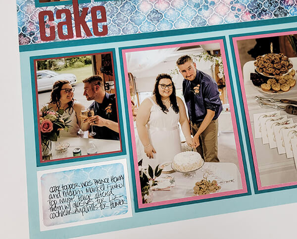
Add a journaling box (Legacy Page Kit cutaparts) in the lower left corner.

I assembled the right page according to the diagram, but rotated it 90 degrees to better accommodate the vertical photos I wanted to use.

The smallest squares became home to pink silk flowers (Legacy Card Kit), mat with a printed cutapart scrap topped with more Red Metallic. (It's important each color used is represented on both the left and right layouts for visual balance.)

I trimmed a photo of my DIL's bridal bouquet into 1.75" squares to fit the 2" teal mats. The "LOVE" cutapart nests perfectly onto the center photo.
Legacy Bonus Layout - Tricia

To replicate Tricia's pages, use the following paper assignments: Pink Metallic (Paper A), Red Metallic (Paper B), and Teal (Paper C). Two Light Blue Plains create the base of the spread.

Crop three photos to 1-7/8" to fit the square mats at the top of the page. Place a sentiment from the Page Kit Cutaparts below.

An extra 3x4" photo fits into the lower left corner. (Unsure of the size? 8x8 grid ruler to the rescue!)

Crop a single photo to span the space between two of the three teal mats. Add the "LOVE" Cutapart.
I'm quite happy with how well both sets of pages turned out. Even though we used the same base papers and Pink Metallic for Paper A, I think the layouts still look and feel very different. What do you think?
Have you scrapped the Legacy Bonus Formula yet? Inspire others by sharing your work on the Club Scrap Chat Facebook group. Hope to "see" you there.
Happy scrapping!
