Members: Have you downloaded your June Bonus Formula yet? If you're not using this super-useful monthly membership benefit, I encourage you to start now!
Not sure where to find it? Check your inbox for your member-exclusive email with important links to the bonus formula, instructions, video tutorials and more. It is sent to active members* on their scheduled shipping day and looks like this:

*An active member is defined as one who paid for and received the current monthly kit.
June Bonus Formula Sketch

The June Bonus Formula creates a well-balanced two-page spread that holds thirteen or more photos. To make the layout, gather five 12x12 papers. Follow the trimming instructions on the printable document, then assemble the layout using the sketch as your guide.
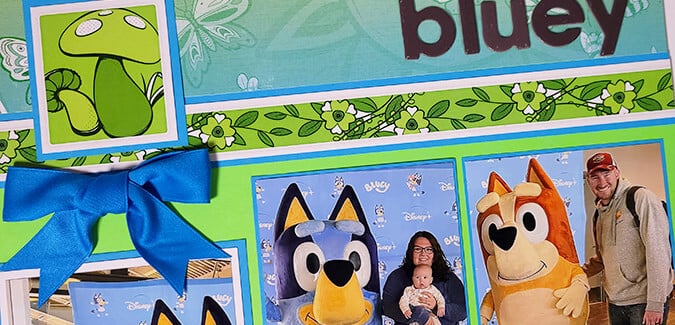
June Bonus Formula Layout - Karen

To create a layout like mine, gather the following Flower Power papers: Mushroom Print (Paper A), Blue (B), Green (C). Two Yellow Plains form the base of the two-page spread.

Since I already knew what photos I'd be placing on this layout, I customized the arrangement to fit my needs.

When trimming photos, don't worry if the image is taller than the mat - I didn't want to lose any of my grandson's preciousness during the cropping process.

Crop a single photo to span the space created by the smaller mats. It's totally okay if the photo extends past the edge.

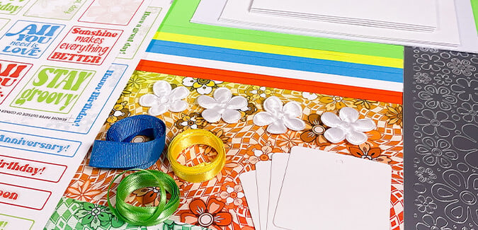
The 2x2" Blue squares nest perfectly onto a trio of white square tags (included in the Flower Power Card Kit). Trim the 3x4" Green mat to create two 1.75" square mats. (I thought about not using it at all, but it's important to make sure all colors are represented on both side of the layout for balance.)

A bit of craft knife magic brings the larger butterfly into the foreground.

The smallest squares feature rounded corners to mimic the shape of the tag. Custom-trim Cutaparts to nest onto the square mats.
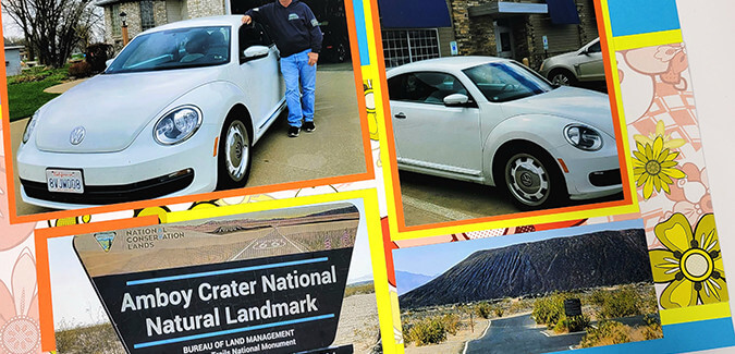
Flower Power Bonus Layout - Tricia

To replicate Tricia's pages, use the following paper assignments: Floral Print (Paper A), Orange (Paper B), and Yellow (Paper C). Two Blue Plains create the base of the spread.

On the left page, an extra 3.5" square photo fits into the upper right corner. (Not sure what size to crop the photo? The 8x8 grid ruler ensures success.)

Trim a single photo to span the space created by the two orange mats. There's even room for a tiny horizontal photo below!

On the right, two extra photos fit the open spaces on the bottom left and right of the page.
I'm quite happy with how well both sets of pages turned out. Even though Tricia and I utilized the same formula featuring papers from the same collection, the layouts still look and feel very different. What do you think?
Have you scrapped the June Bonus Formula yet? Inspire others by sharing your work on the Club Scrap Chat Facebook group. Hope to "see" you there!
