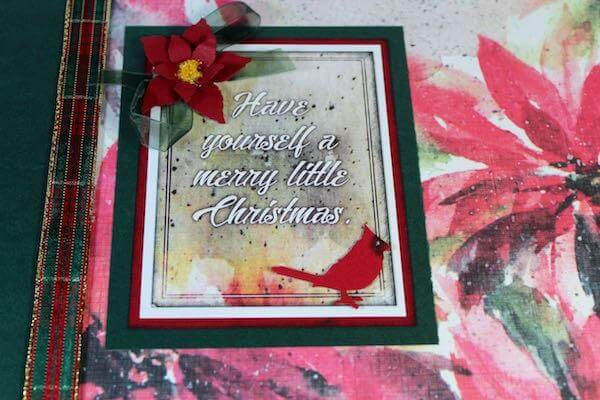
I decided to make my Navigation Greetings to Go cards a bit more ornate. Only two of the twelve cards could be considered "simple". The rest, I’m afraid, ended up at the mercy of my coffee and tea- induced creativity.
Because some techniques show up on several cards (others are only used a time or two), I thought it’d be best to share photos of each card with a close-up of the detail.
The inked edges were done with my Spectrum Noir markers. I like the way they bleed better than when I use an inkpad for the same task. Oh, and lots and lots of dimensional adhesive was used. Lots, and lots and lots and lots . . .
4¼x5½” WHITE CARDS

The trick here is to use the inside greeting as the bottom piece of bread for the spinner-string sandwich. Oh, and don’t place text or other artwork on the inside back of the card where it could be seen through the window when the card is closed.

I designed the custom dies in Photoshop and then imported it to my Cricut Explore. Add texture with an embossing folder.

Flower is hand-drawn with White Signo pen, and Spectrum Noir pencils for added shading.
This is one of the two pretty simple cards. I LOVE the white Signo pen, it’s perfect. It makes framing darker stock possible.

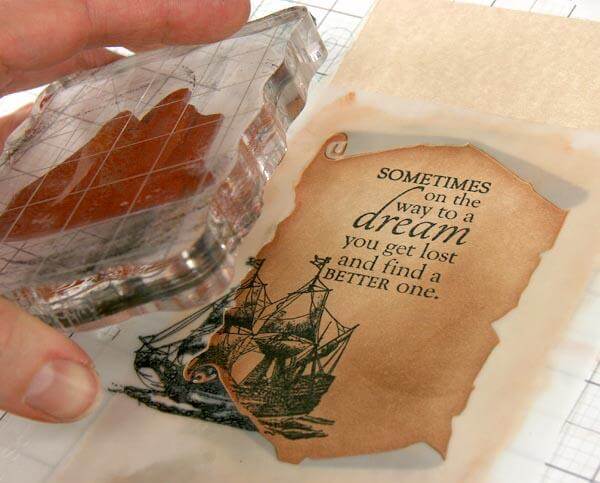
Mask off top and bottom of the card after image is stamped, then fill the space with ink (or watercolor).
4½x6¼” DARK GREEN CARDS

Custom-made harlequin template using white scrap stock colored with Spectrum Noir pens and matching pencils. The border was drawn with thin black marker.

This is one of my faves, the photos just don’t do it justice!
Since the Navigation Light Green didn’t ‘pop’ enough from the vivid green hand-made paper, I used Pan Pastels to make a shadow gradation from the center to the outside of the hand-made panel. This created a nice shadow behind the Light Green metal die-cut and really made it pop. Inking the edge of the die-cut drew out the color from the Cutaparts and the hand-drawn rectangle border on the hand-made paper.

Pan pastels add definition to the custom designed die-cut.

Add pen and marker work before you run your stock through the embosser. It’s much easier to make straight lines on flat paper.
5x7 TAN CARDS

For each of the four 5x7" Tan Cards, the main, front artwork is all attached to the Wine panel so that it lifts freely from the tan card base.


For the insides of the cards, I used kit photo mattes as bases and matted the greetings. Using pens and pencils to make frames gives a faux double-matting look. This super-easy technique is done with the clear Grid Ruler.

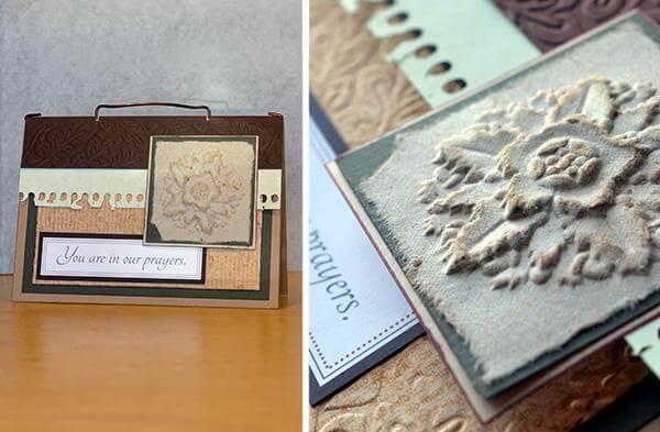
Lots of pen framing on this one. The whole front section of the card isn’t connected to the card base, so there may be a hidden message behind the happy birthday.
I hope these cards inspire you to add custom touches to your next set of Greetings to Go!