
I just love it when things come together! I recently finished assembling the Industrial Evolution page kit and it took very little effort to find photos to match this versatile collection.
Industrial Evolution Page Kit
I noticed when Tricia initially designs the layouts for each collection, "color pairings" often seem to emerge. With Industrial Evolution, Layouts 1-2 and 5-6 are predominately gold and burgundy, while the remaining two page spreads were primarily two shades of blue. This allowed me to rearrange the "pairings" to suit my needs.
Layout 1 & 6
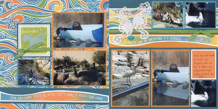
A number of photos from our 2019 California vacation still need a home. This spread documents a lovely evening spent with Mike's brother and husband. We were thrilled they were able to drive from Arizona to San Diego to spend a few days with us.

Layout 3 & 4
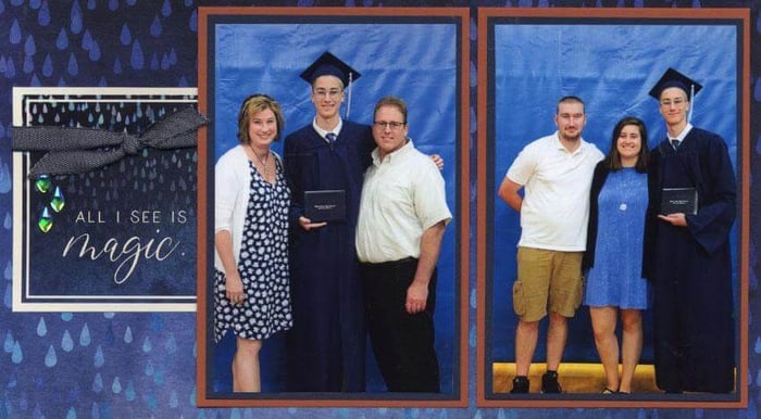
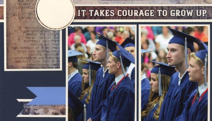
As luck would have it, the blue pages were a great match for my oldest son's graduation photos. (Now I just have to add journaling!)

Layout 7 & 8
Even the sentiments seemed ideal for graduation photos. On the left layout, I cropped a single horizontal photo to fit across the two vertical mats at the top of the page. One additional photo fits into the open space in the bottom corner of the right page.

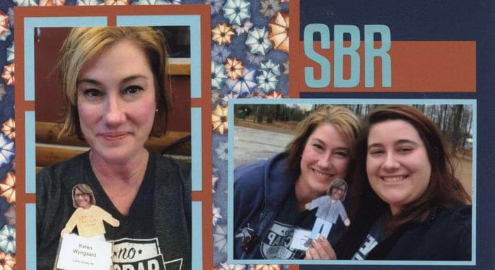
Layout 5 & 2
The rich colors of this two-page spread complimented photos of a recent event at the Paine Art Museum in Oshkosh. (I have a feeling you'll see a few more photos from this occasion crop up in future blog posts.)

The colors and artwork of the Industrial Evolution page kit are so versatile, you may have trouble deciding which pictures to put on it!
Happy scrapping!