Many don't realize how versatile the layouts from the Gone Wild page kit really are. This collection is a perfect example of where folks get limited by the theme. However, I'm here to prove you don't need animal or zoo photos to make full use of this collection. The colors are the first thing I look at once the pages are completed. This neutral palette goes with almost anything!
GONE WILD LAYOUTS
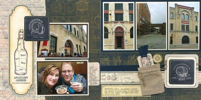
Since our 2018 Retreat was held at the Tundra Lodge in Green Bay, I thought the safari feel of these pages would be appropriate for scrapping my photos. I could have filled my pages with images of the various taxidermy critters found throughout the hotel . . . but there isn't a single fauna photo in sight!

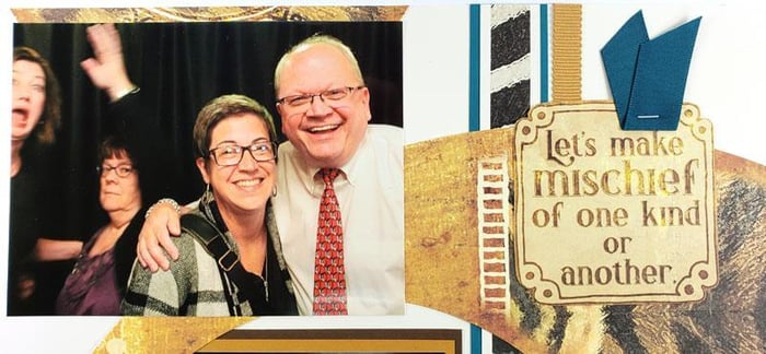
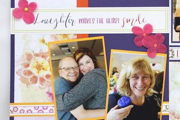
The sentiments fit well with the Retreat activities, too. Retreat is a ton of fun . . . but the staffers are usually pretty exhausted by the time 9pm rolls around.

Lambeau Field photos on zebra print? Yes, please! I just love these pics of the "real" Julie retracing the steps "Flat Julie" took years ago.

Friday night's theme was Casino Royale (black, white, and red), but that didn't prevent our more formal photos from looking great on Gone Wild. The pops of red look amazing against the animal prints.

With my recent love for addiction to Nuvo drops, I couldn't resist adding hints of copper to the dots on the border strip.

I hope I've opened your mind to the potential of Gone Wild. Once you let go of the limits of the "theme", the possibilities are endless! Happy scrapping!
![]()


