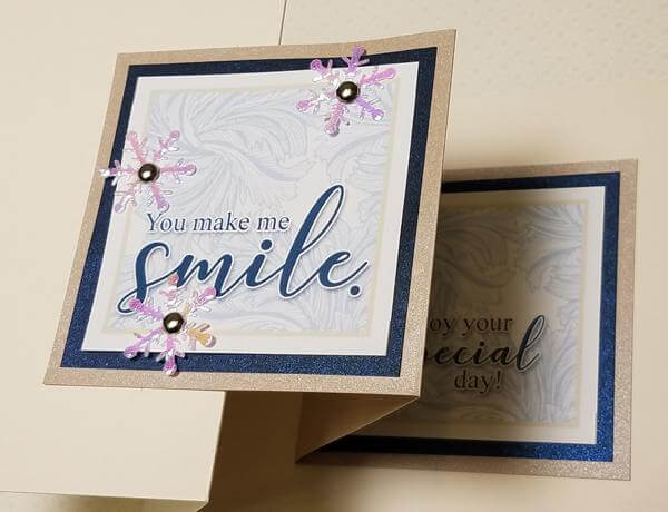
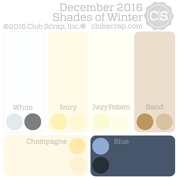
Our goal for December's Shades of Winter collection was to fashion the designs with a very neutral palette while adding a gorgeous complementary anchoring color. We once again turned to our favorite Italian paper mill for a stunning shade of metallic blue.
A NOTE FROM TRICIA
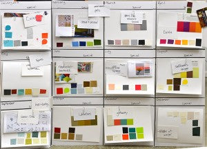
It's difficult to grasp that we're wrapping up 2016. It seems like such a short time ago our design team was meeting to plan the year. We began the process in September of 2015 by asking our members for input on themes and color palettes, brainstorming color schematics, and narrowing down kit names. Here is a picture of the original planning board when we began the new year.
Countless meetings, brainstorming sessions, design revisions, purchase orders, and kit building hours have gone into making this vision a reality. I want to sincerely thank my incredible team for their diligence and hard work. I also am so grateful for your loyalty and membership. We couldn't make it happen without you!
WHAT'S AHEAD?
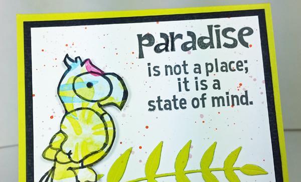
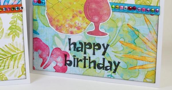
January's kit was inspired by the traditions, colors, and patterns of wax resist Batik designs. Our theme, Color Me Happy, will be a cheerful and fun way to bring in the new year!
KIT AND COLOR DETAILS
We chose a modern, cursive calligraphy font called Kissita and balanced it with the classic Times New Roman font pre-installed on most computers.
The neutral color palette allows you to incorporate virtually any shade of ink, but we used the following CS® colors for the majority of our projects: Sapphire, Ruby, Ash, Jet Black, Metallic Silver, and White Pigment.
DELUXE LAYOUTS
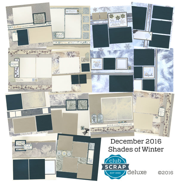
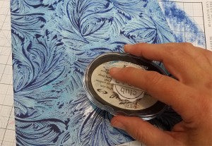
Before diving into the page assembly instructions, be sure to familiarize yourself with the paper names/colors. We've included White, Ivory, Sand, White Pattern, and Champagne (metallic) papers in the collection. We've also designed an 8.5x11" White raised print that becomes even more stunning when ink is applied directly to the paper. Simply wipe away excess ink from the raised areas after rubbing the pad across the paper until the desired color intensity is achieved.
GREETINGS TO GO

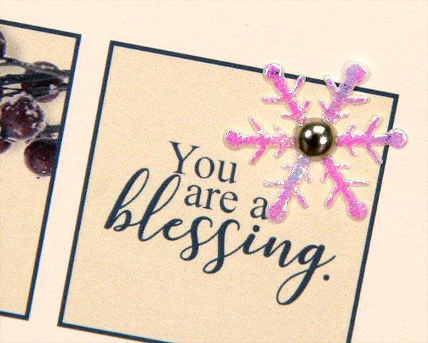
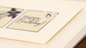
I love the elegance and simplicity of this card set, right down to the placement of an Ivory cutapart onto an Ivory panel with foam adhesive between the layers.
I'll have more details about the Shades of Winter collection on tomorrow's blog. Don't miss it!
Tricia


